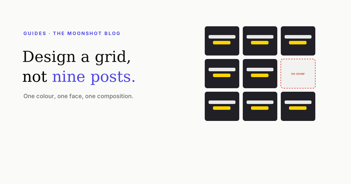
A profile visit is the highest-intent moment in your entire funnel: someone liked one clip enough to tap your name and is now deciding, on nine still images, whether you’re worth following. That decision is made in about two seconds, and it’s made about the grid as a set — not about any individual post.
Covers are read as a set
This is the part that surprises people: the individual images in both grids above could be equally good. What differs is whether they were designed with each other in mind. A visitor isn’t evaluating your best post, they’re pattern-matching — and consistency is the pattern.
The three decisions that do it
- One accent colour. The single strongest identity signal at thumbnail size, and the one people most often vary for no reason. Pick one and use it on every cover.
- One headline typeface. Two at most — a transcript face and a hero face — and never a third. Type is recognisable long before it’s readable.
- One composition. Where the face sits, where the text sits, how much of the frame each takes. Repeating a layout is what turns nine images into a template.
Everything else — subject, background, mood — can vary freely. Those three cannot, and they’re free.
Design for the tile, not the cover
A grid tile is a centred ~3:4 crop of your 9:16 cover. Anything in the top or bottom sixth of the design doesn’t exist here. That means the composition you’re standardising has to be composed inside the crop, not inside the full frame — the numbers are in the safe zone guide.
What not to spend effort on
- Multi-tile murals. A picture split across nine squares looks impressive once and constrains every future post. It also breaks the moment you publish anything.
- Checkerboard patterns. Alternating post types by position means planning your content around an arrangement rather than around what’s good.
- Planning the sequence. Plan the treatment. Which square a post lands in is decided by your posting order and changes constantly.
- Deleting posts to fix the look. A tidier grid isn’t worth losing the reach and social proof of a post that worked. Change its cover instead.
Optimise the first nine, then stop
One screen is the decision unit. The return on tidying posts below the first scroll drops off steeply, because the people who scroll that far have generally already decided. So:
- Fix the treatment for future posts — palette, type, composition.
- Redo the covers on the current top nine so the visible screen is consistent.
- Redo anything older that still gets traffic, since those clips are still sending people to the profile.
- Leave the rest.
Quick answers
Does the Instagram grid still matter?
More than it used to, because covers are how a profile visitor decides whether to follow — and that visit is the highest-intent moment in the whole funnel. It matters less as an art project: elaborate multi-tile murals cost a lot and convert nothing.
What makes a grid look consistent?
Three things, in order of impact: one accent colour, one headline typeface, and one composition (where the face and the text sit). Get those three right and it reads as a body of work even when the subjects are unrelated.
Should I plan my grid in advance?
Plan the treatment, not the sequence. Deciding your palette, type and composition once means every future post is consistent by default. Planning which post lands in which square is a lot of effort for an arrangement that breaks with your next upload.
How many posts does a visitor actually see?
About nine — one screen — before deciding. That's the unit worth optimising. Anything below the first scroll is for people who have already been convinced.
One treatment, every cover
Generate covers from your clips with the same headline style, palette and composition each time — so nine posts read as one account.
Open the thumbnail maker