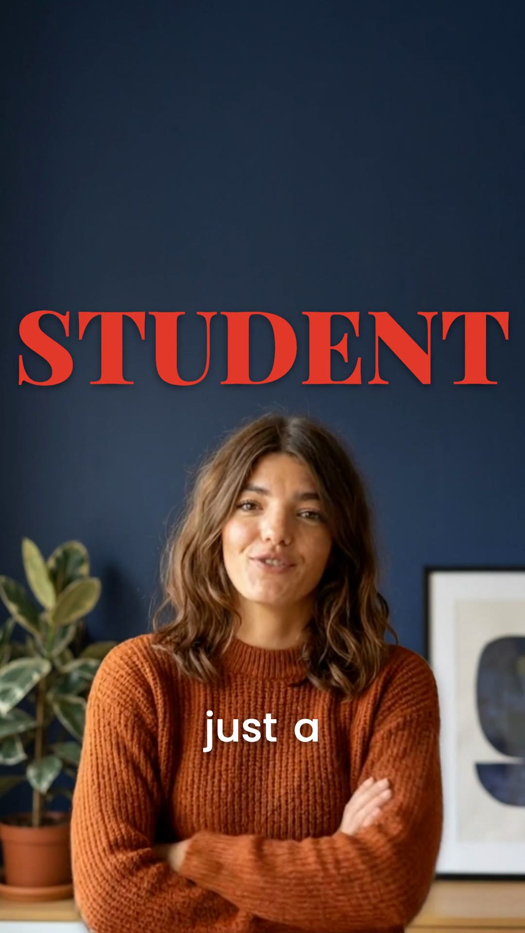
Somewhere in early June a very specific look started multiplying on Reels: a speaker talking straight to camera, one enormous red serif word standing behind their head like a magazine masthead, and a small white subtitle ticking along on their chest. Creators call it the Kumar template. It is now everywhere — finance explainers, gym rants, study-tok — and it works for reasons that are more interesting than “red is loud.”
What you’re actually looking at
Strip the trend down and there are exactly four decisions in the frame, and every viral copy of it keeps all four:
- One word, not a sentence. The red word is a label — STUDENT, ACCOUNTANT, BROKE. It names the speaker or the viewer, and it appears once, full-bleed, and stays put.
- It sits behind the person. The head and shoulders occlude the letters. That single detail is doing most of the production-value work.
- An extreme serif, unstroked. The classic cut is Playfair Display Black — a Didone with hairline thins against slab-heavy thicks. No outline, no box; just a soft drop shadow so it survives busy footage.
- A quiet subtitle in front. Poppins Medium, plain white, karaoke-timed to the voice, riding low on the chest. It never takes the accent color — the red belongs to the hero word and to nothing else.
The color deserves precision, because most recreations get it wrong by defaulting to pure red. The reference clips run a vermilion — in our template it’s #E2382A — which keeps red’s urgency but sheds the “error message” note that #FF0000 carries. It also holds up better against skin tones, which matters when the letters spend the whole clip touching a face.
Why red — and why only one word of it
Feeds are a salience competition. Long-wavelength colors, red first among them, produce visual “pop-out”: in a field of competing stimuli, a red element gets fixated earlier and held longer — the same effect that makes a red element the first thing you find in a where’s-the-button UI test. Instagram’s chrome is white, black, and gray; talking-head footage is mostly skin, wall, and shirt. A full-bleed vermilion word is frequently the only saturated red object on the entire screen, including the app around it.
Red also carries arousal. Color psychology gets oversold, but the durable finding is that red reliably reads as urgent, dominant, and important across contexts — stop signs, corrections, breaking-news lower thirds. The template borrows that register and staples it to a noun.
And the noun is the second trick. The word is almost never decorative — it’s an identity claim. Self-referential information gets privileged processing: your own name in a noisy room, your job title in a headline. When a viewer who happens to be a student scrolls past a giant red STUDENT, the word functions as a targeting system. The clip has selected its audience before the audio even starts.
One word is also the ceiling, not a stylistic preference. Two red words compete; a red sentence is just a poster. Our own template enforces this in code — the accent tier is capped so exactly one hero word per phrase can take the serif and the color. We learned the hard way: an early build let ordinary words take the accent, and clips came out with a lone red serif “A” floating on someone’s chest. Restraint is the feature.
Why behind the head beats in front of it
Here’s the part most breakdowns skip. Text pasted over video reads as interface — your brain files it with subtitles, stickers, and ad chrome. Text that’s partially hidden by the speaker triggers occlusion, the strongest monocular depth cue we have. The letters get parsed as an object in the room, behind a person, in the scene’s 3D space. Interface is ignorable; scenery is not.
Occlusion buys three things at once:
- Perceived production value. Viewers can’t articulate why, but they know overlay text is free and “in-world” text is expensive. Until recently it was — putting type behind a moving person meant rotoscoping every frame.
- An unblocked face. The word can be enormous without covering the eyes or mouth. Face-visibility drives watch-through on talking-head content; the template gets a 120-point headline and uninterrupted eye contact.
- A micro curiosity gap. When the speaker’s head hides two letters of the word, reading it takes an extra beat of inference. Trivial effort, but it’s effort spent — and those first hundred milliseconds of engagement are exactly what the retention graph is made of.
If you want the machinery — how a per-frame person cutout actually gets computed in a browser, and again on GPUs at export quality — we wrote up the whole pipeline in Text Behind Your Head: How Real-Time Person Matting Works.
The serif is doing quiet work too
Playfair Black is magazine-masthead typography — the visual language of Vogue covers, where the subject’s head famously overlaps the logotype. That’s not a coincidence; the template is a Vogue cover that talks. The extreme thick/thin contrast codes as editorial and considered, which is why the word carries authority instead of reading like a meme caption. And it’s exactly why the letters stay unstroked: put an outline on a Didone and you fill in the hairlines — the contrast that makes the font expensive is the first casualty. The shadow, not a stroke, handles legibility.
Meanwhile the subtitle runs in a geometric sans at reading size, because at 1.3× playback speed nobody has time for serifs down there. High-contrast display face for the one word you must feel; neutral text face for the sixty words you must parse. It’s the same hierarchy every art-directed magazine spread has used for a century, compressed into a vertical video.
The full Kumar Method is four acts
The caption lockup is what got copied, but the original account format is a complete edit grammar, shot like a corporate-villain trailer. It reduces to four beats:
- The call-out. Name the audience — that’s the red word’s real job.
- The expectation you break. “Everyone tells you to…” followed by the turn.
- The mission, with stakes. What the speaker is doing about it and what it costs.
- One human moment. A crack in the delivery — the part people quote.
On screen, that structure is dressed with a few dark, cinematic photo cutaways on named things — and, crucially, nothing else. No floating emojis, no background swap, no confetti. The restraint is the look; every added element spends the authority the serif and the red just earned.
Getting the look, with and without the pain
The manual route: duplicate your clip in After Effects or CapCut PC, rotoscope the subject (Roto Brush if you’re lucky, frame-by-frame masking if your hair is doing anything interesting), place the text layer between the plates, then re-track the mask every time you trim. Budget twenty minutes per clip, more if you move.
The reason the trend stayed niche for a while is exactly that cost — and the reason it exploded is that the cutout stopped being manual labor. Moonshot computes the person matte automatically (instantly in the browser for preview, then at export quality on GPUs), so the Kumar preset is a one-click card: upload the clip, pick Kumar, and the transcript’s emphasis words take the red serif behind your head on their own. The cutaways and inserts from the original account format stay a manual choice — the template gives you the lockup, not a replacement for your footage.
Quick answers
What is the Kumar template?
A short-form caption style where one large red serif word — usually a label like STUDENT or ACCOUNTANT — sits locked behind the speaker's head while a clean white sans-serif subtitle plays in front. It spread across Instagram Reels in June 2026 and is named after the Kumar Method account format that popularized it.
What fonts does the Kumar template use?
The classic pairing is Playfair Display Black (an extreme thick/thin editorial serif) for the red hero word, set in all caps, and Poppins Medium for the white subtitle. The red is a vermilion — around #E2382A — rather than a pure red.
How do you put the red word behind your head?
The word is rendered on a layer between the video background and a per-frame cutout of the person (a matte). Manually that means rotoscoping the subject in After Effects; automated tools like Moonshot compute the person matte for you, so you type the word and pick the template.
Can I make the Kumar template in Moonshot?
Yes — it ships as a one-click template. Pick Kumar under Behind the Person and you get the red serif hero word locked behind your head with clean white subtitles in front, computed from an automatic person matte.
Try the Kumar template on your own clip
Upload a talking-head video, pick the Kumar card, and the red word is behind your head in about a minute — matte included, no rotoscoping.
Open Moonshot free